Design Problem: Conceptualize and brand the fictional 2030 World Expo in Johannesburg, South Africa. Then, utilize that brand identity to create event posters, signage, monuments, vehicle/ plane graphics compiled in a brand guidelines document.
My Solution: Create a colorful propeller icon logo to enrich all brand applications!
I. Brand Concepting Process
Concepting: Before designing, I first refined the Expo’s concept and brand essence which would then determine my final visual direction.
In this particular Expo 2030, the theme was “Sustainability and Equality.” After researching Johannesburg and its past with apartheid and pollution, I decided that my Expo 2030 would focus on progression, forward movement, and improvement.
Brand Voice: As the core of the brand’s essence and meaning to its visitors, the brand’s voice (who and what Expo 2030 is) was as important as the visuals.
Brand Words: Honoring, Growing, Innovating, Welcoming, Protecting
II. Visual Branding Process
Once I defined Expo 2030’s perspective of progression and forward movement, I began to sketch out some ideas for the brand’s icon.
Elements of Icon & Connection to Brand Essence:
X and Y Axis: Intersection of Sustainability & Equality
Overlapping: Different Groups of People coming together in Unity at the Expo
Propeller Form: Moving Forward
III. Evolution of Brand Mark
-

Best Icon Sketch
-

Digitized icon in Illustrator
-

First Draft of Full Brand Mark
-

Final Draft of Refined Brand Mark (Preferred Mark)
IV. Final Brand Mark Versions
-

Horizontal Mark
Used whenever vertical space is limited and the preferred mark can’t fit.
-

Middle Mark
Used whenever both horizontal and vertical space are limited and preferred mark won’t fit.
-

Preferred Mark
Utilized whenever possible; mandatory in official EXPO 2O3O documents, tickets, signage, advertisements, etc.
-

Vertical Mark
Used whenever there is horizontal space is limited and the preferred mark can’t fit.
V. Final Brand Mark Artwork
These are the primary color lockups for the marks, shown here using the preferred mark.
I: Color Positive
II: Color Reversed
III: Black Positive
IV: White Reversed
VI. Colors
Color Palette: Along with the brand voice and logotype, the color palette for my Expo 2030 was integral to its visual experience. I chose a rainbow-like palette to demonstrate the bold and bright message of betterment in equality and sustainability.
Color System: A color palette would be nothing without a system, so I made one on the right! The colors are broken down into 3 groups: tints, brights/main colors, and shades.
VII. Usage Guidelines
Clear Space: In order to let the brand mark speak and shine, adequate space around its elements are required. Thus, the clear space, or blank space (x) around the mark free of other graphics is displayed.
Do’s and Dont’s: It is always necessary to respect and protect the integrity of our logo as is. Therefore, here are some examples of good and bad usage of the mark.
VIII. Branding Applications
Vehicle Graphics
-

Bike Graphic
-

Car Graphic
-

Plane Graphic
Flag Signage
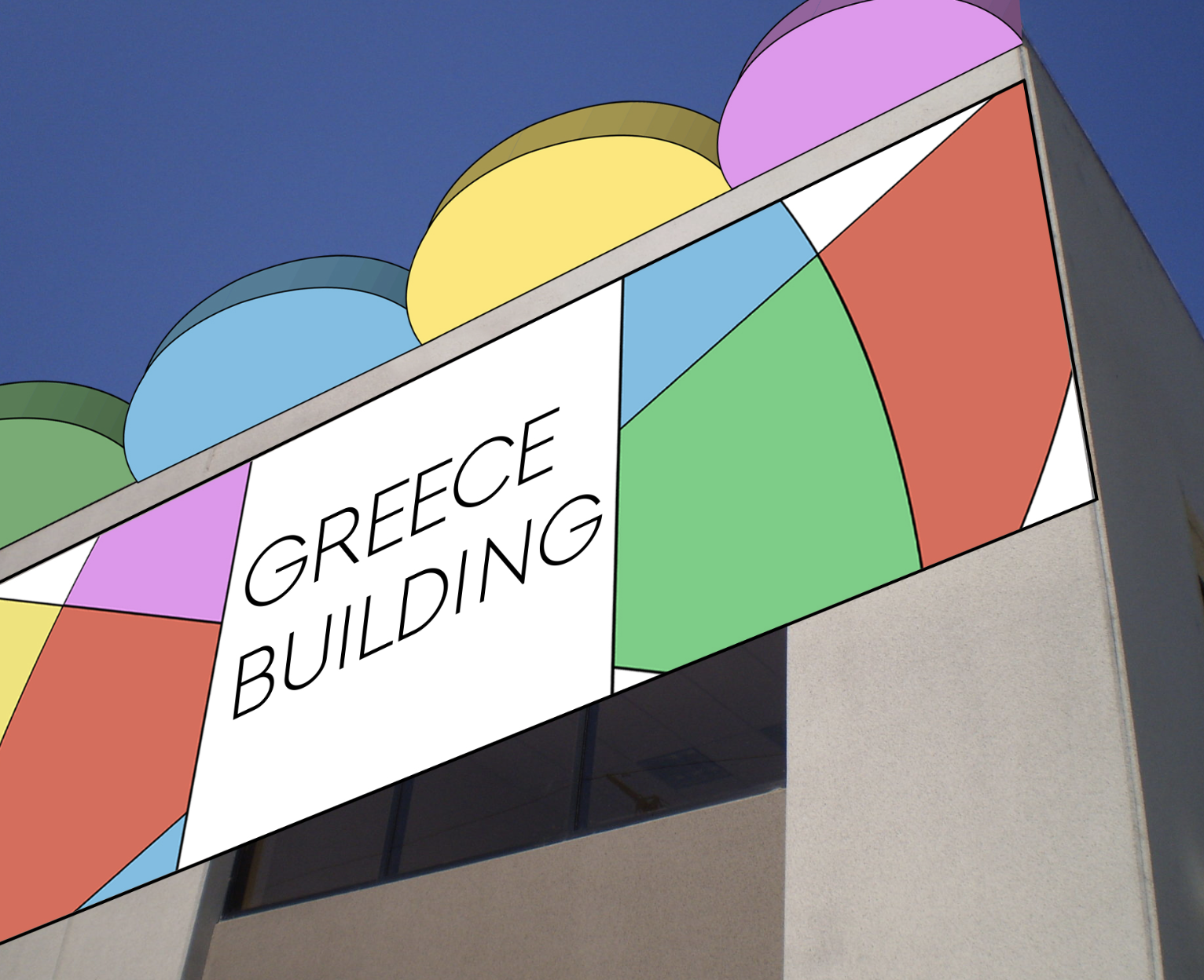
Building Signage
-

Directional Signage
Complete with icons I designed myself, these 3D signs would be scattered all through the Expo to direct visitors to restaurants, restrooms, security, help desks, and parking. As with the building signifier, I utilized more sections from the brand icon and 3D rendered them to create the unique shapes for the signage.
-

Building Signifier
This is how the signage for each building would be displayed, with a supergraphic behind the building name, as well as 3D rendered pieces of the brand icon as roof accents.
-

Entrance Monument
In Expo 2030, there would be a large-scale sculpture monument to mark the entrance building. To make this, I rendered a 3D version of the brand mark’s icon.


